Global marketplaces, such as Etsy, Amazon and Ali Express, offer niche products to attract buyers in search for creativity. However, it does not offer a platform for local sellers who offer services or have limited time, resources and funding. These sellers look for local buyers, who are looking for speedy delivery or nearby services, e.g., Make-up artists (MUAs).
Connecting people is one of the core values of the Boutique App. Alongside contributing to sustainable practices, such as reducing transport pollution by using local delivery.
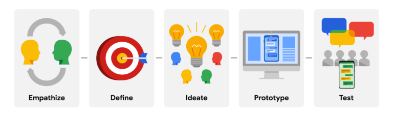
This case study is a small collection of the comprehensive process used in my designs. To ensure user-centred designs, this project adopted Google’s User Experience (UX) approach as shown below.
PROCESS
1. Empathise
In London, there is a novel community building around social media platforms. Individual sellers are using social media to reach out to buyers nearby. London has a fantastic public transport system, connecting multiple boroughs. Many people can enjoy travelling to different parts on trains and buses and reach a destination in London, usually within an hour.
To deepen my understanding, I interviewed five people in my network with varying occupations: administrator, teaching assistant, bank clerk, student and customer service. It was required for all to have purchased a customised item within the last 12 months using a social network app, such as Instagram.
I aimed to keep questions open-ended during the interview. This encouraged a natural flow of conversation and follow-up questions. Here’s what was asked:
How was your experience purchasing a customised item?
What motivates you to shop on this app?
How do you feel purchasing from individual sellers?
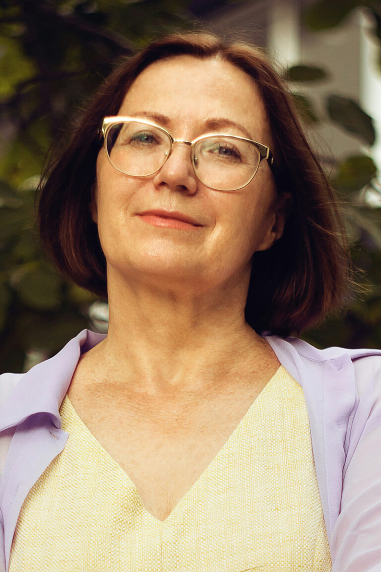
Based on their responses, I was able to form descriptive personas based on real experiences. Meet Jenny, Priyanka and Mathew.
Credits to Jixiao Huang, Unsplash
Meet Jenny, 54
Jenny is a cashier and lives alone. Recently, she injured her hip falling off a chair. She continues to work, however her muscles stiffen and become painful if she sits or stands too long at one time. She isn’t tech savy but can do her grocery shopping online on her desktop computer. Her granddaughter is turning one. Jenny would like to purchase a keepsake, personalised toy for her granddaughter’s birthday.
Goals • An online shop that resembles her previous experiences to online shopping • Quick search to find what she needs so she does not have to sit too long • Opportunity to personalise an item
Credits to Nicholas Pinto, Unsplash
Meet Matthew, 18
Matthew is a student, on a busy schedule between college and football practise. He is celebrating his first anniversary with his girlfriend. He would like to make it special and is booking her a makeup artist (MUA) and dinner out. His anniversary falls on a school night and therefore he is restricted on time. He is looking for a local MUA, reasonably priced, and able to get his girlfriend ready before 7pm, so they can spend more time together hanging out.
Goal • Find a reliable makeup artist who will come on time • Find an artist who is reasonably priced compared to other local MUA • Find an artist who is local and will not charge additional fees for transportation
Credits to Sanjeev Nagaraj, Unsplash
Meet Priyanka, 34
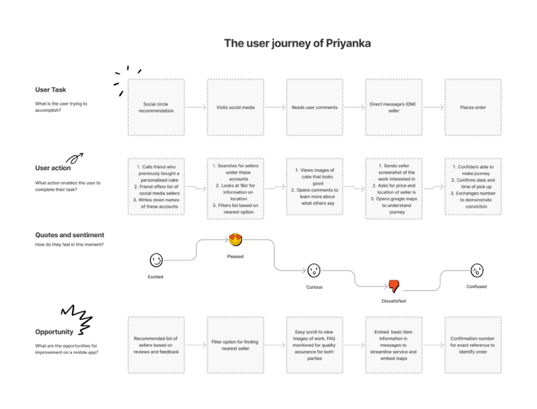
Priyanka is a part-time teaching assistant and mother to 3 children. Her sister, recently engaged, requested her to be one of the bridesmaids. Priyanka is responsible over desserts during her sister’s mendhi event; an Indian pre-wedding celebration. She is quite busy managing her own family and work. She needs to find a local baker who can prepare customised cupcakes to match the mendhi theme, colours and egg-free (her son has an egg allergy) . Finding a local baker is a lengthily process. It requires calling up friends, checking credibility by viewing work of sellers on Instagram, and back and forth messaging to establish details of customisations.
Goals • Find a local seller who can customise cupcakes • Find information about the seller to ensure credibility • Establish cupcakes meet dietary needs
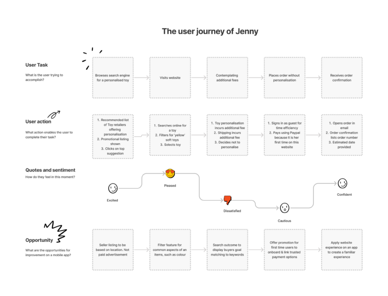
I used my personas to identify how an order, requiring high-level of communication, is currently being placed using a user journey map.
2. Define
A competitive audit allowed observations on the current market trends of creative platforms. Highlighting the services of competitors enabled gaps in the market to be discovered.
Direct competitors were Instagram, Notonthehighstreet and Etsy. These platforms allowed private sellers to showcase their work from any location as long as they register as a ‘business’, which excluded a large group of individual sellers. Indirect competitors, such as Amazon and Ebay were too large on a commercial scale and required sellers extensive work and monetary input to showcase their work.
As a result, sellers became popular and recognised on social media platforms, such as Instagram. While Instagram is a solution, it is not a viable option for new users to find these accounts because sellers were found through verbal recommendations. User journeys, along with insight from competitor audits, I was able to define the following pain points:
Transparency
Add-ons omitted by sellers in description.
Discovery
Talented local sellers are difficult to find.
Personalisation
Personalisations difficult to communicate.
Delivery
Delivery fee could be wavered/reduced for locals.
3. Ideate
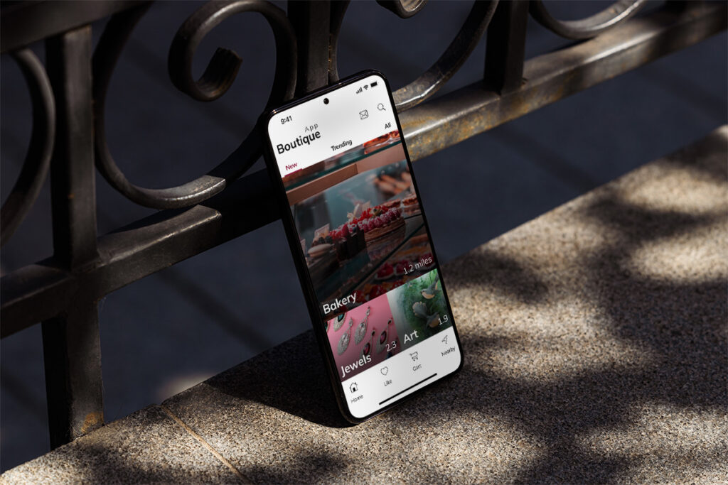
After analysing strengths and weaknesses of my competitors, I conducted the ‘Crazy Eights’ exercise to pinpoint features essential on the minimal viable product (MVP). In this exercise, I had eight frames, eight minutes to create eight notable features that tailors the Boutique App to meet user needs. I used this as the foundation for my low-fidelity wireframes, as shown below.
4. Prototype
User research investigated my initial prototype based on the hypothesis of whether the designs tackled user pain points.
The aim of this study was to figure out if users were able set the location, personalise a product/service and pursue further support from the seller to create a successful enquiry.
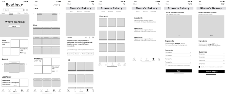
Below is the first mock-up of the relevant screens. These mock-ups were used to create a prototype for user testing.
The following metrics were used as performance indicators (KPI) to identify the effectiveness of the initial designs. The findings showed: Navigation vs search. 70% Users preferred to use secondary navigation on the home page for categories to start their search.
Error rates. 80% Users felt confused by placeholder (lorem ipsum text) and the grouping of unrelated buttons ‘Message’ and ‘Add’ on product page.
System Usability Scale (SUS). 40% showed inconsistency to familiar experiences (vertical scroll over horizontal) increased the complexity of the task to order personalised cupcakes.
More so, during the study user body language, facial expression and comments provided a rich understanding of their user experience. I recorded and grouped observations under common themes on an affinity diagram, as seen below.
TAKE AWAY
User experience
Based on the findings, I was able to establish the essential features required to make a meaningul impact to our user’s experience of the Boutique app. These insights were:
Multiple-entry points. Based on user needs, whether new or returning to the app, top and bottom navigations were used for the goal desired, such as messaging a seller or setting the location. The secondary navigation was replaced with promotional categories into the ap, such as new or trending.
Automated capture of item. A gallery of items, on the seller’s page, displayed an overlayed message icon. Once clicked, it automatically collected data about the item the user was viewing to enquiry about. This aimed to create a seamless start to a conversation between the seller and user.
Colour palette. The colour palette did not reflect the intended 60:30:10 rule, whereby the neutral aimed to uphold 60% of the colour palette. Instead, the branding colours dominated each screen, reducing the high contrast required for easy readability for all. Thus, the colours were reapplied for accessibility reasons, whereby only one shade of the brand colour was used throughout the app for text.
Summary
This project aimed to bring people and communities together for social good and ecological sustainability.
In future, I’d like to carry out a follow up research to identify impact of certain features within my designs, for example:
How was user experience during the conversations with the seller on the app?
Could any repeat task be automated?
How useful was the app during seasonal periods, such as Christmas, to find niche gifts?
Data in design Google analytics was used to determine common screen size amongst current users. The average size was 390 x 844px for mobile and 1920 x 1080px for desktop. I approached responsive design, using a mobile-first approach.
Mock-ups
I hope you enjoyed reading this case study. This project was part of supporting designs for a start-tup business. If you’d like to learn more, please get in touch.