I joined Framework Digital (FD) at a pivotal moment, allowing me to work on multiple products, from designing and analysing their website to creating corporate documents, such as roller banners, email signatures, and proposal templates.
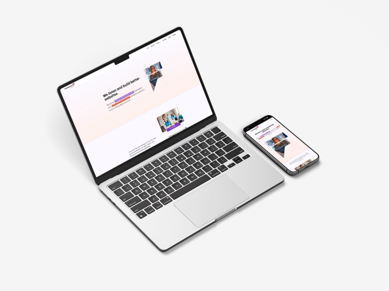
I began redesigning the website using a user-centered approach, onboarding all stakeholders from the start and involving clients and remote testers in user research. This project adopted a mobile-first approach, starting with mobile and gradually designing for desktop.
Before I joined, rebranding workshops determined the logo, brand colours, and font styling. While this provided a helpful style guide, understanding the current target audience was necessary to meet desirable conversion rates that were not achieved with previous web designs. My role as a user experience designer was to adopt the rebranding on the new website and then evaluate the effectiveness of my design solutions using Google Web Analytics (GA4).
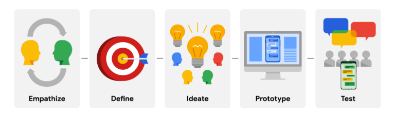
Following industry standards towards a UX approach, I adopted Google’s five-stage process: Empathize, Define, Ideate, Prototype, and Test.
PROCESS
1. Empathise
As part of my primary research, I conducted stakeholder interviews. This helped me identify the current user flow, how traffic was acquired, and extraneous variables likely to influence the website. For example, keywords used by users on search engines directly influenced the metadata and wording the business wanted to display on their homepage, such as ‘web designer,’ ‘charity web designer,’ and ‘businesses.’
Example of an empathy map
Empathy Mapping
The interview led to empathy mapping to understand how a user would feel as they travelled through the website to reach a service. Several issues were identified, such as:
Lack of accessibility on the headings and nav item labels
Inconsistent font styling between paragraphs and headings
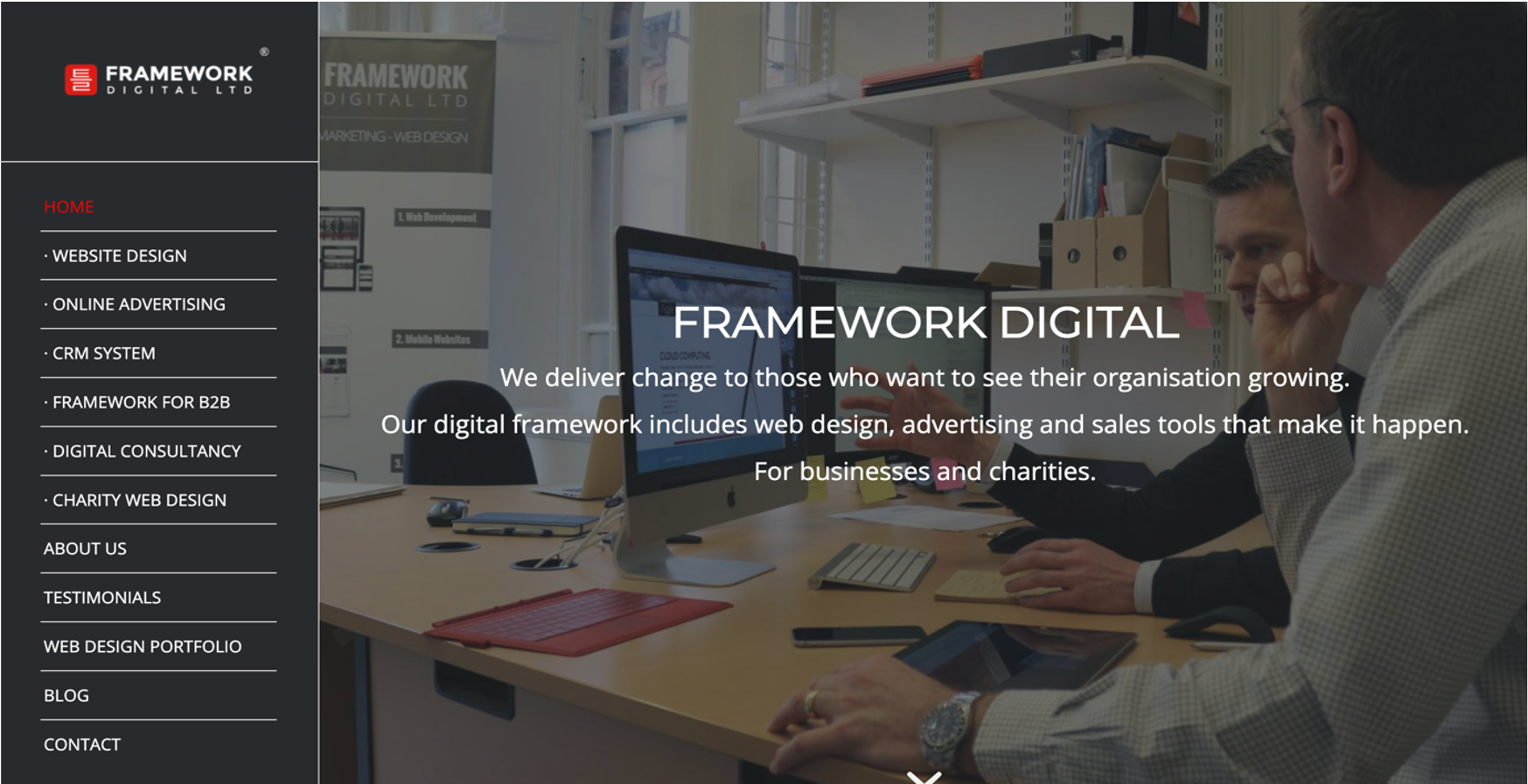
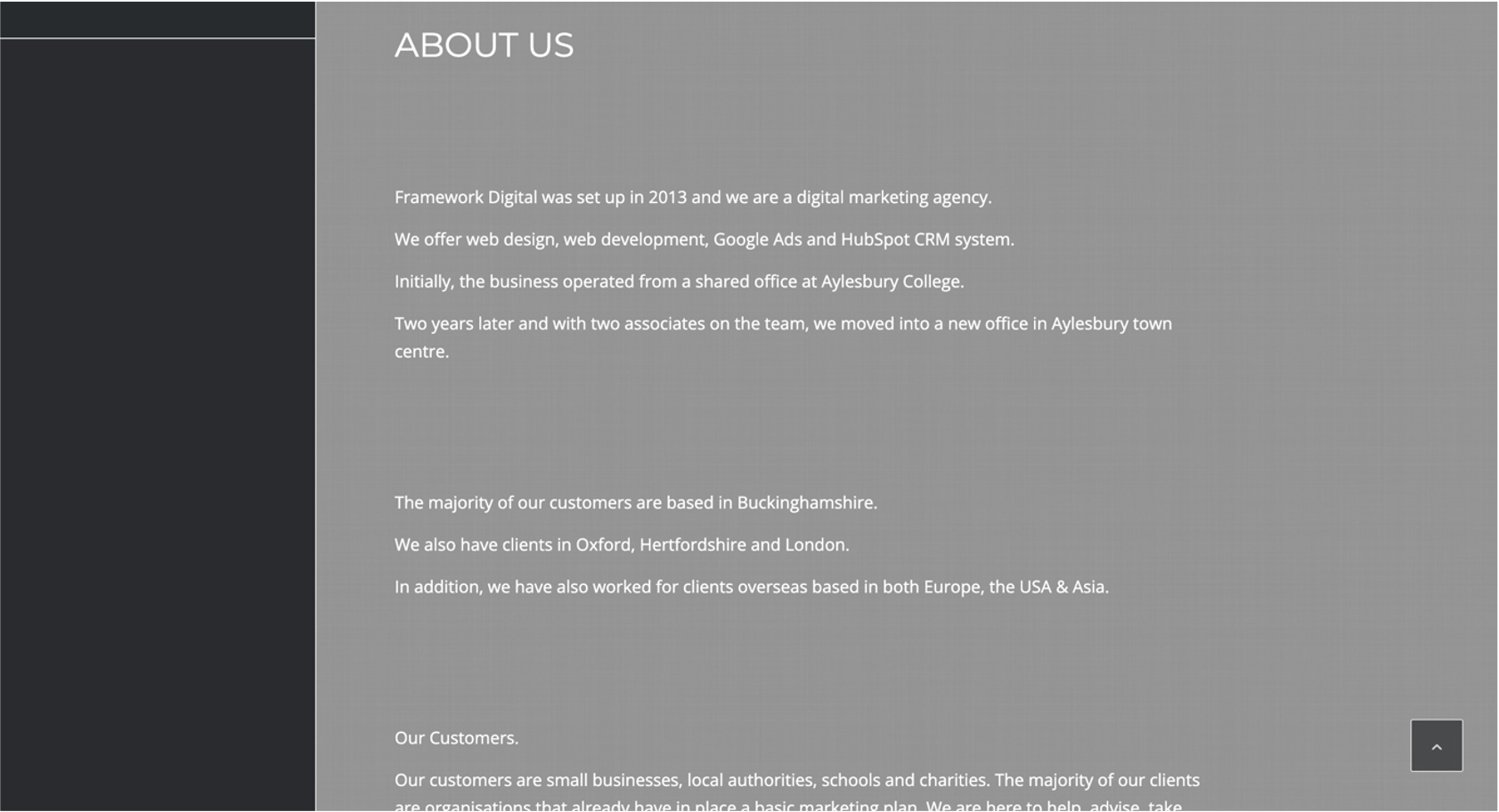
Empathy mapping was conducted on the previous website, shown below.
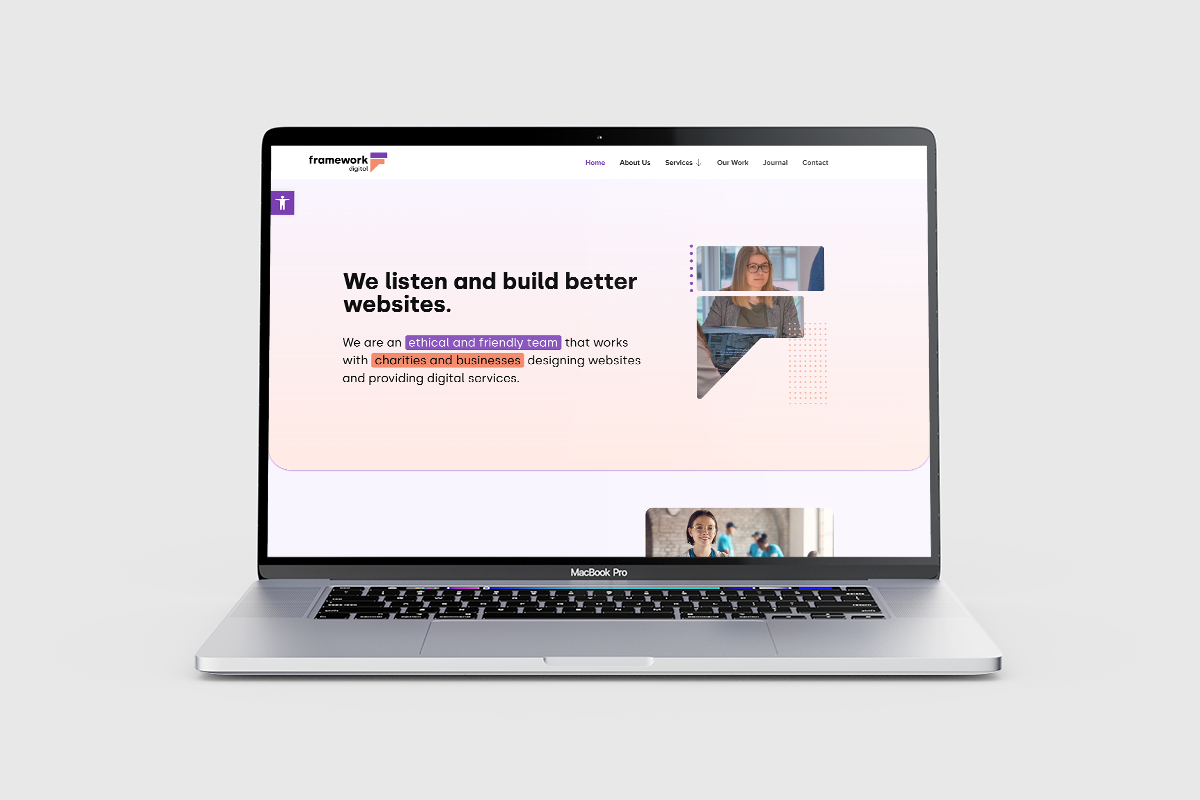
Home page
About page
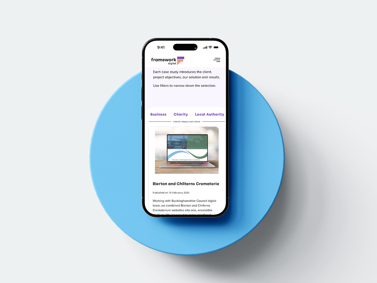
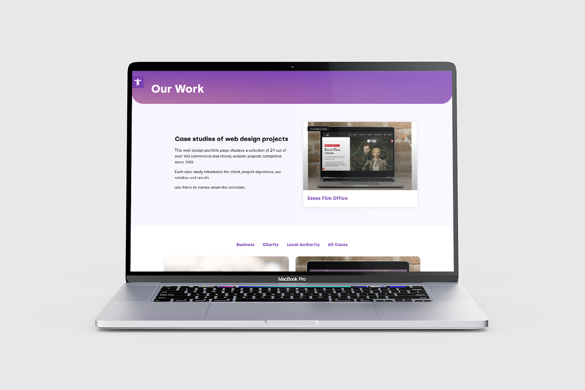
Portfolio (Our Work)
2. Define
A design sprint tackled the Define and Ideate stages. This allowed stakeholders to express their thoughts on current user frustrations, offer suggestions based on their direct involvement with clients, and highlight Unique Selling Points (USPs) the business offered as a B2B.
I adopted an online whiteboarding tool, FigJam, to facilitate the design workshops. After active involvement in multiple activities, we filtered down to three key pain points users faced that hindered their website experience:
Clear start points
There was no call-to-action button to encourage users to take action.
Easy-to-read main navigation
The main navigation items displayed in inaccessible font.
Portfolio engagement
Lack of visual appeal and meaningful functionalities
I crafted personas based on the target audience, modelling these pain points as they attempted to achieve their goals. This demonstrated how users felt so stakeholders could see the challenges faced on the previous website.
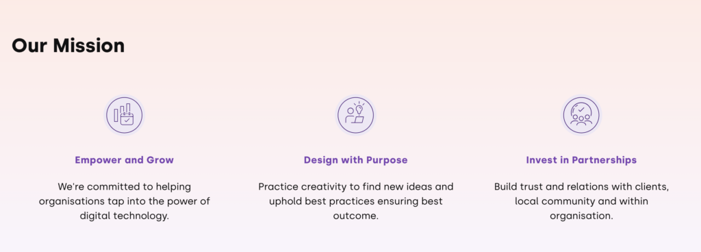
During the design sprint, I found a remarkable gap in the message communicated to users and the business values. The website did not mention sustainable practices as part of their mission, even though this was evident in their interactions with clients. We identified three practices FD was proud to display as part of their mission.
Sustainable Practises
Other sustainable practices included:
Eco-hosting on their hosting page
Workshops offered to clients on their hosting page
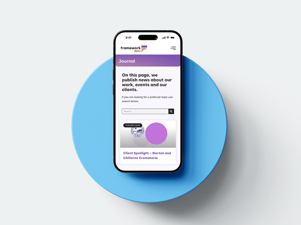
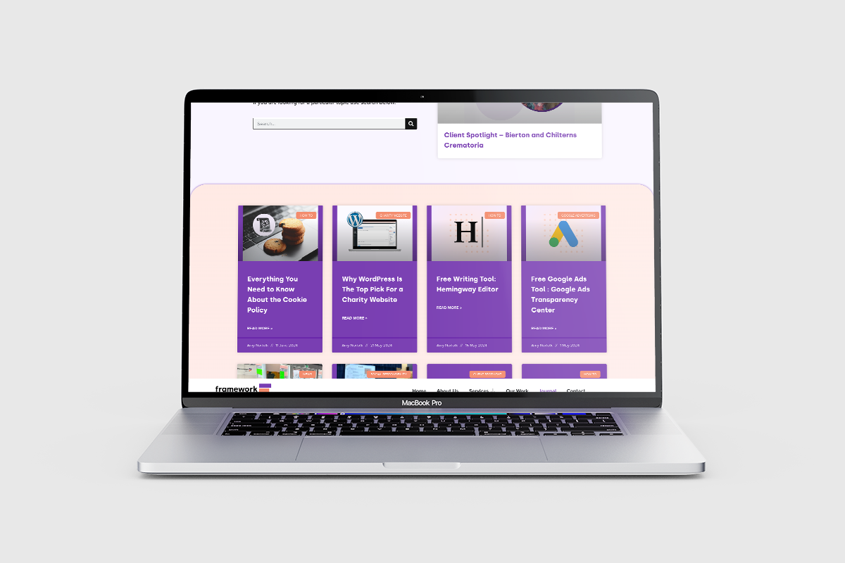
Community events and partnerships on their journal page
3. Ideate
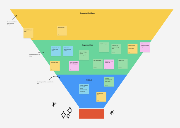
Stakeholders participated in the Crazy Eights exercise to bring their experience and vision. A filtering activity identified the essential features required to address current user pain points, establishing the brief for the prototype.
Filter activity to determine essential features on the MVP.
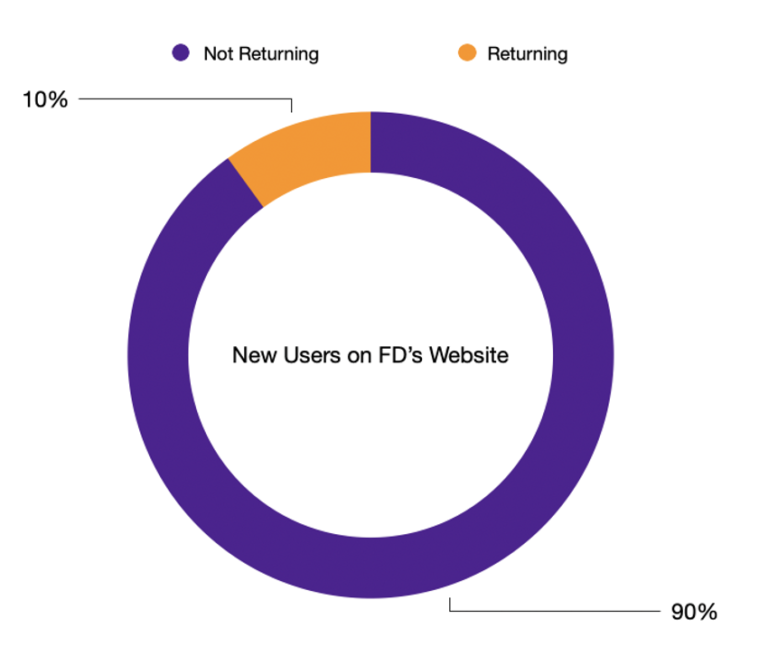
Example of data pulled from GA4
Google Analytics (GA4)
Using data from GA4, we identified current user behaviours:
New user retention was at 10%
User journeys often started on landing pages derived from outdated posts
Average user engagement was 40 seconds per page
4. Prototype
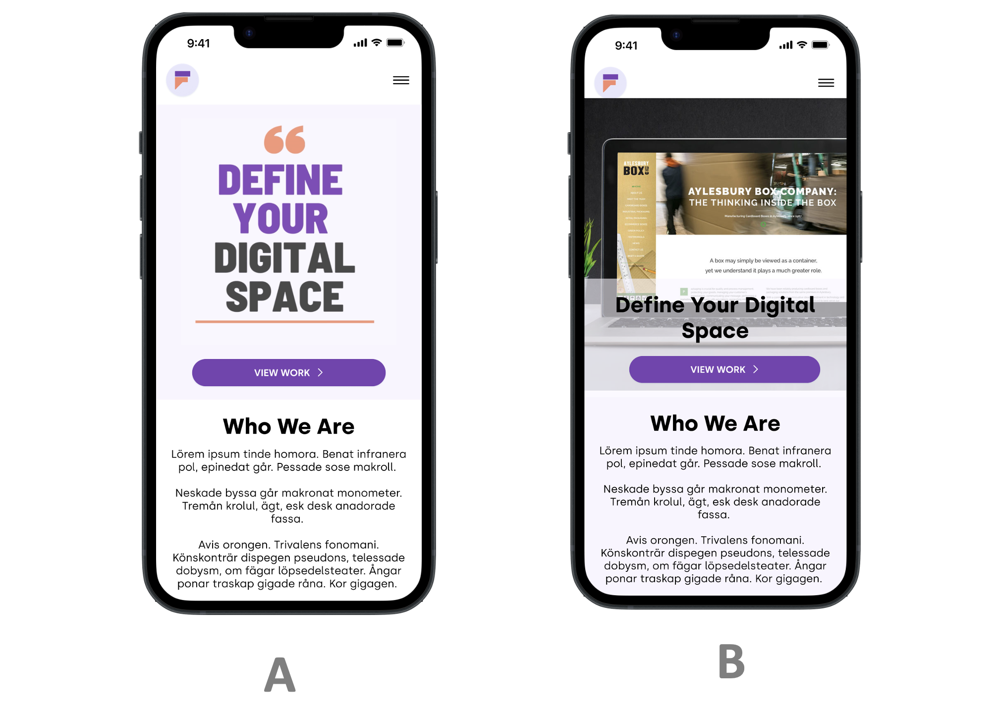
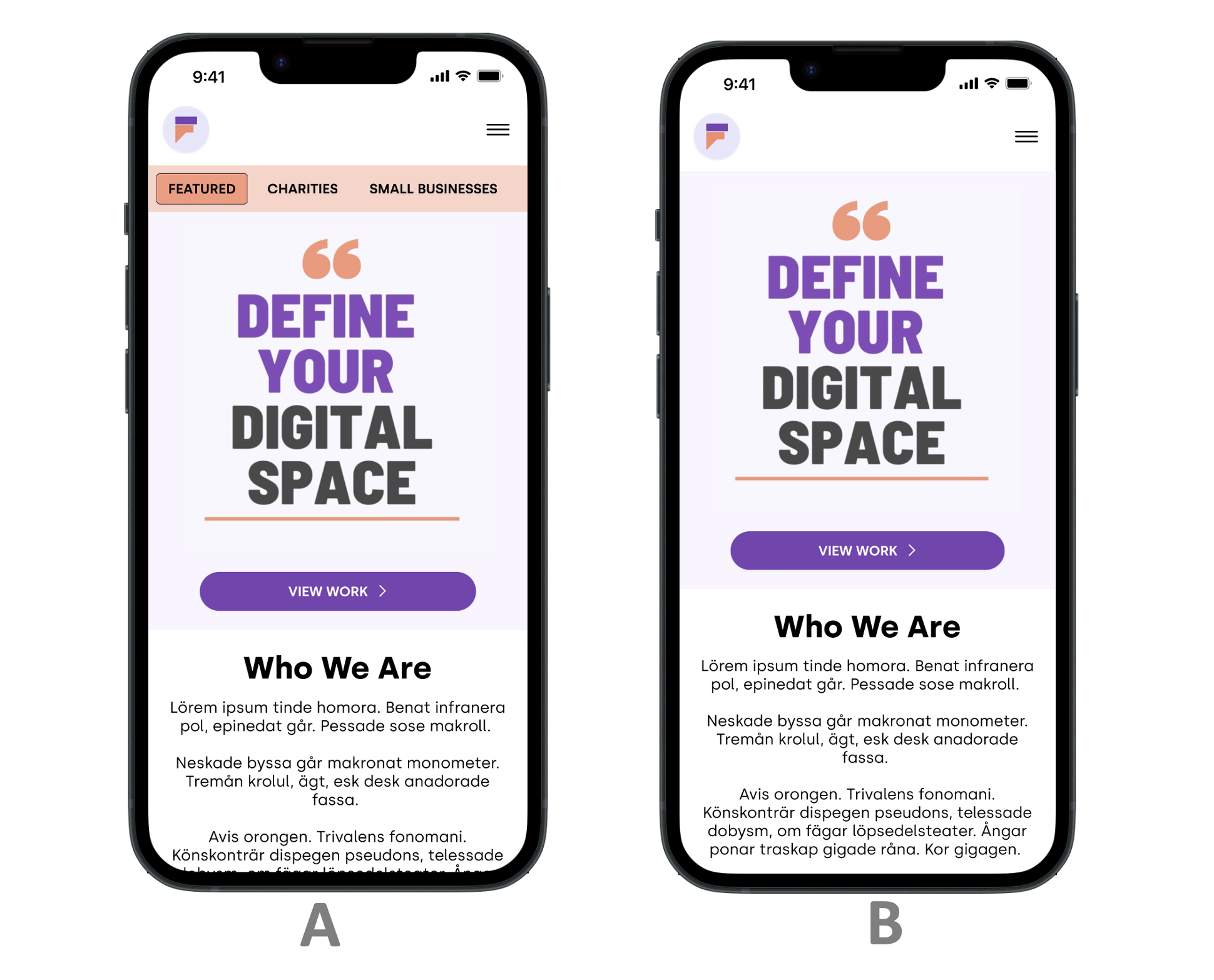
I presented digital mock-ups to stakeholders through A/B testing before creating the final prototype. This prototype was then used in user research with clients and remote testers.
AB testing with stakeholders
AB testing with stakeholders
AB testing with stakeholders
5. Test
I developed a proposal for a user research study and observed user behaviour through heatmaps and their responses. Participants included remote Maze testers (predominantly in America) and in-person testers (previous or current clients).
Metrics
System Usability Scale: Measured navigation pain points.
Conversion Rate: Observed via heatmap to measure clear start points.
Drop-off Rate: Tracked to measure visual appeal and functionality.
Findings
53% clicked on the Call-To-Action button on the homepage.
9% dropped off after 57.9 seconds before arriving on the final page.
85% found the suggested designs visually appealing on the case study page, though some expressed a need for a search engine feature.
TAKE AWAY
Post - launch analysis
Three months after the redesign, we observed:
Increased user acquisition and engagement time.
Traffic from new channels like Instagram and LinkedIn, with 6 new users.
Engagement time increased from 44 seconds to 3 minutes.
Four new clients, one found the website organically through a search engine.
Summary
This project combined design and research to offer a user-centered experience. In the future, I would conduct post-launch analysis during a non-seasonal month to avoid data skewed by holiday breaks.
Additionally, based on user feedback, we implemented a search engine on the journal page and focused on displaying the best and most recent work to aid navigation on the case study page.
Following the launch of the initial designs, the website was subject to further iterations.