Café ordering apps does what it says on the tin, order café items on an app. Yet, does it allow you to label your coffee cup amongst many others? Does it allow you directly contact the chef about a food allergy? Or offer table service if you’re in store?
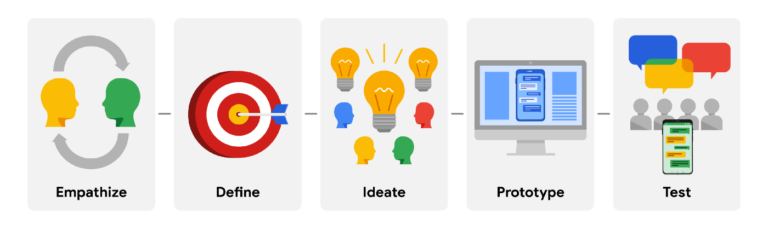
This case study is a small collection of the comprehensive process used in my designs. To ensure user-centred designs, this project adopted Google’s User Experience (UX) approach as show below.
PROCESS
1. Empathise
To empathise with my user base, it was essential to make real-time observations at a café. More so, I interviewed people to deepen my understanding and identify common pain points. To share existing user experience when ordering, I used personas to share their story. Meet Andre and Yasmine.
Credits to Unsplash
Meet Andre, 41
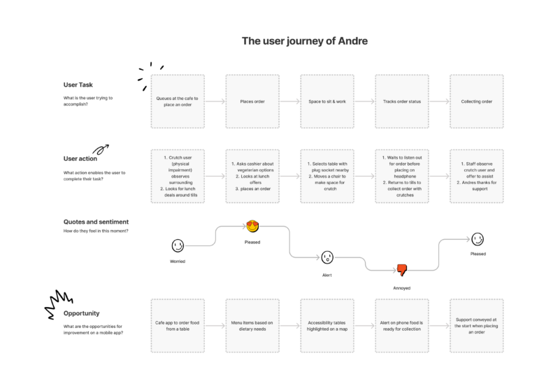
Andre is a new dad and works in healthcare. He takes evening coding classes to transition into tech. Recently, he injured his leg playing football with his friends. After work, he uses cafes as a place to study for a few hours, before he goes home to support his family. Since his injury, he has been using crutches to get around. After toppling a few items on display, he soon realised his local cafe is small and the queue area is narrow.
Goals
Order online and have food brought to his table with cutlery
Wifi and socket to use the space as a learning environment
Affordable food and snacks that also meet his dietary requirement (vegetarian)
Credits to Unsplash
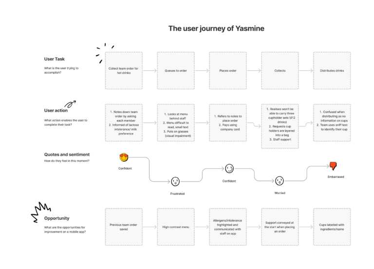
Meet Yasmine, 25
Yasmine is a junior assistant, who supports her manager arrange Monday morning meetings for the team to kickstart their week. Yasmine purchases hot drinks from the local cafe but a lot of time is spent waiting around for the coffee to be made and, later, distributing the cups to her team. Yasmine is worried this will negatively impact her image at work.
Goals
Her goal is to deliver the drinks while it is still hot
Order online and visit the cafe only when collection is prepared
Help her team quickly identify their hot drink
I used my personas to identify how an order, requiring high-level of communication, is currently being placed using a user journey map.
2. Define
A competitive audit allowed observations on the current market trends of café apps. Highlighting the services of competitors enabled gaps in the market to be identified.
My direct competitors, ‘Pret a Manger’ and ‘Joe & the Juice’, offer hot drinks and healthy meals at reasonable prices, operating around business hours. While my indirect competitors, ‘MdDonalds’, ‘Starbucks’ and ‘Subway’, had their own target audience. McDonalds serve fast-food, Subway target people interested in fresh food, while Starbucks target an audience primarily interested in their beverage collection.
Here are some of the gaps in the market I noticed:
Users could not browse without sharing personal details first
Allergen information was not saved, likewise to recent orders, reducing the chances of user retention
While McDonalds offered table service in store, this was not available on the app
Using Andre’s and Yasmine’s journey, along with insight from competitor audits, I was able to define the following pain points
Allergens
Some apps listed allergens as a small print text or a separate document.
Browsing
Personal details required to login before browsing the menu.
Accessibility
Table service not offered on the app.
Labelling
Bulk coffee orders usually aren’t labelled.
3. Ideate
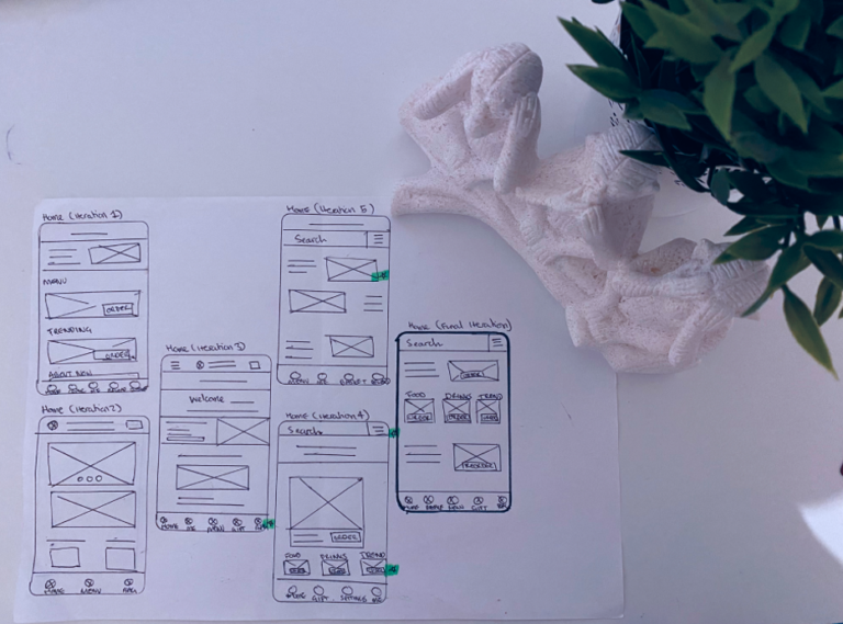
Low-fidelity (lo-fi) wireframes constructed the foundations of how information would be presented on screen. Focusing on lo-fi designs, using paper and digital, enabled concepts to be rolled out quickly and efficiently.
Below, I trialled concepts. I iterated over anchor points for the home page to encourage user-engagement.
I used digital wireframes to map out the rest of the user journey, applying best practices on content display.
4. Prototype
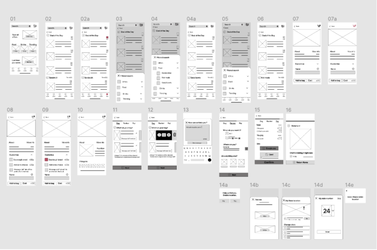
User research was conducted to identify the effectiveness of the initial mock-up designs.
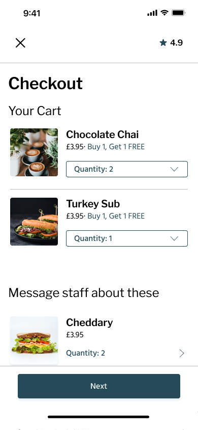
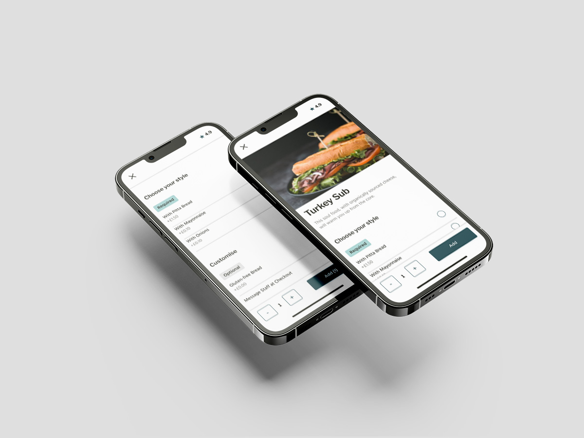
The aim of this user research study was to figure out if users were able browse, communicate with staff and place the order from a table (allocated number). Below are mock up designs of the prototype used in user research.
Based on these findings, the following insights were identified:
Maintain the in-app navigation. Removed search to utilise the small space on mobile screens.
Remove the CTA on the menu list. It didn’t make an impact and only use it for promotional items on home screen.
Reduce the content at first glance. On the product page, move nutritional information below to view through vertical scroll. Also, left-aligned text to improve readability.
Reduce user input (click events). Filter option was replaced by a secondary navigation. After reflection on the findings, I optimised my designs for enhanced user experience.
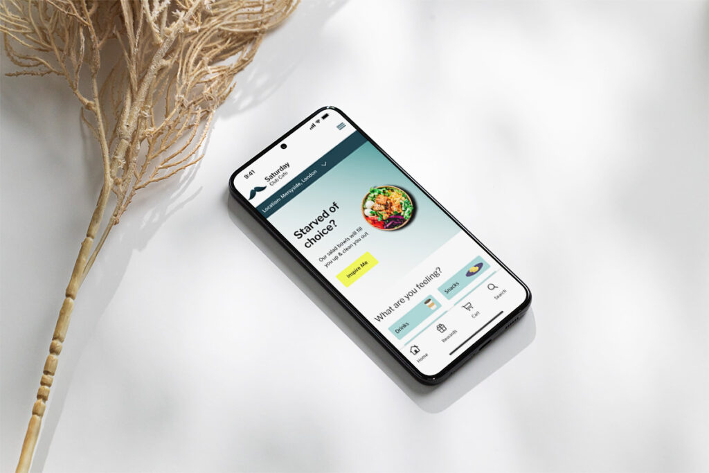
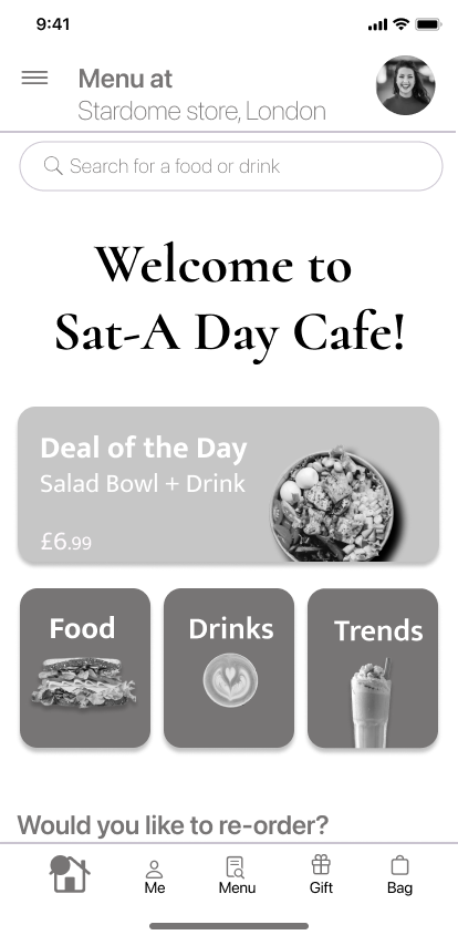
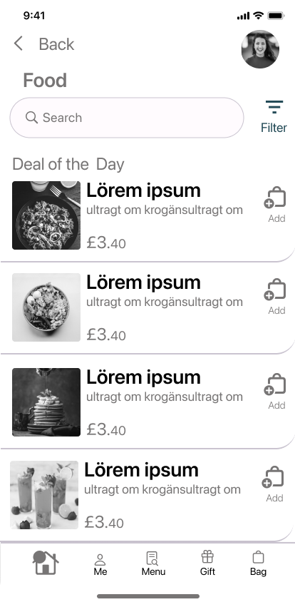
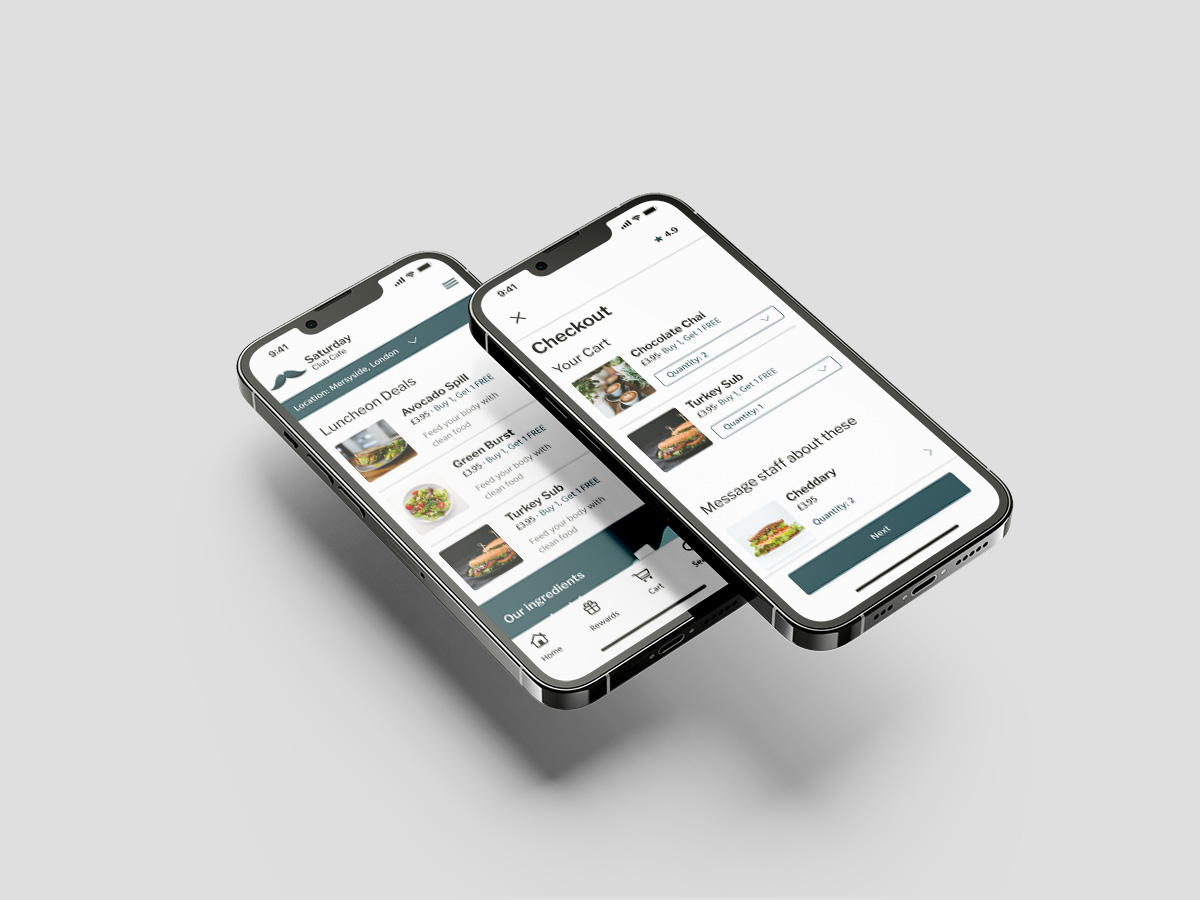
Below are the iterated designs for the Saturday cafe app, post user research.
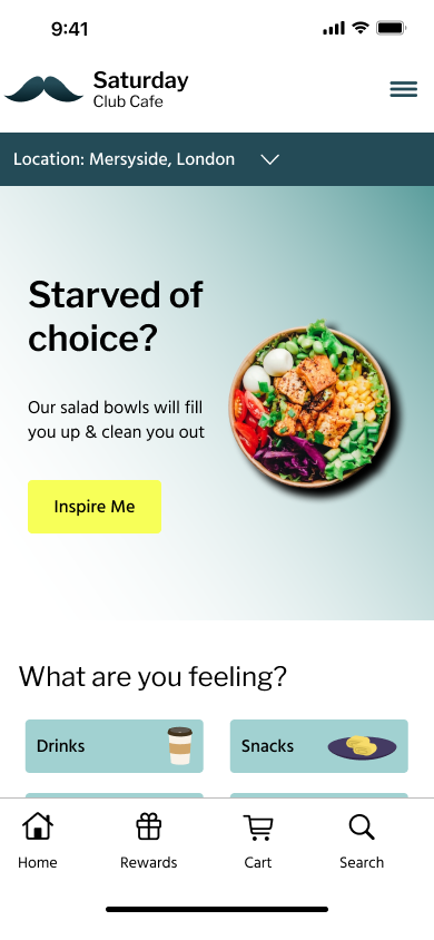
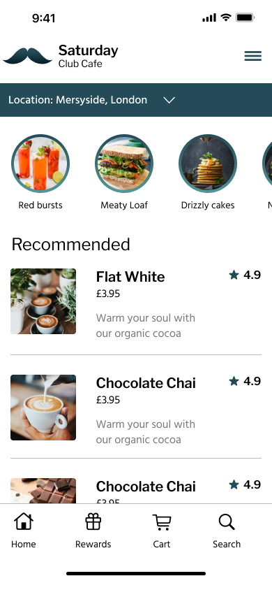
Below is an overview of the updated prototype for Saturday cafe app.
TAKE AWAY
User experience
At the start of this process, Yasmine faced the challenges of placing bulk orders, distributing coffee cups without name labels and collecting her order on time.
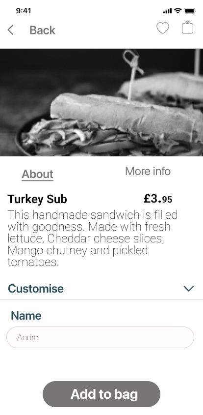
With the name-labelling feature, Yasmin will be able to place names on the product page. This will help her distribute the hot drinks correctly, and in turn, allow her teammates soak into their choice of drink while it is still warm!
At the start of this process, Andre faced the challenges of carrying his food from the tills to his table due to his injury.
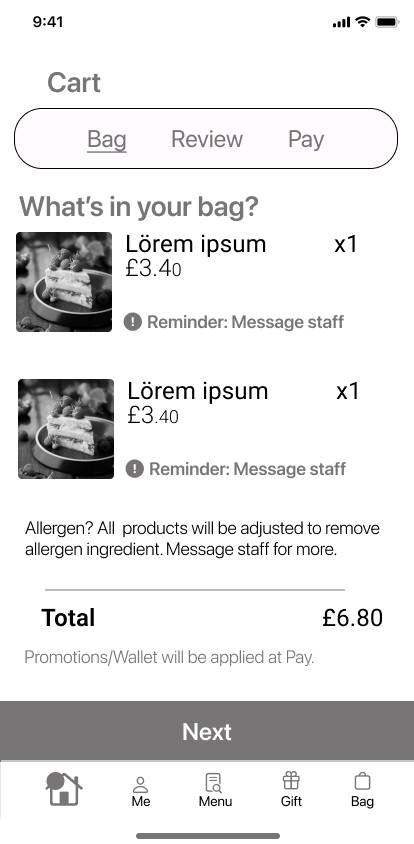
With the messaging feature, Andre will be able to request assistance at the store. This will allow him to focus on his studies and feel more comfortable at his table without having to worry how he will balance his crutches along with a tray of food.
Summary
This project aimed to remove barriers, in particular for users with physical impairment, by enabling clear communication between café staff and their customers.
In future, I’d like to carry out a follow-up research to identify impact of certain features within my designs, for example:
Can repeat users have their medical/allergens remembered by the app without infiltrating user’s privacy and questioning data protection (GDPR)?
What is the percentage of users ordering from home, at the table or on click and collect? And has the new feature of table service increased users on the app?
This project was part of attaining the Google UX Professional Certificate and is only a snippet into the process. Please email me to learn more.